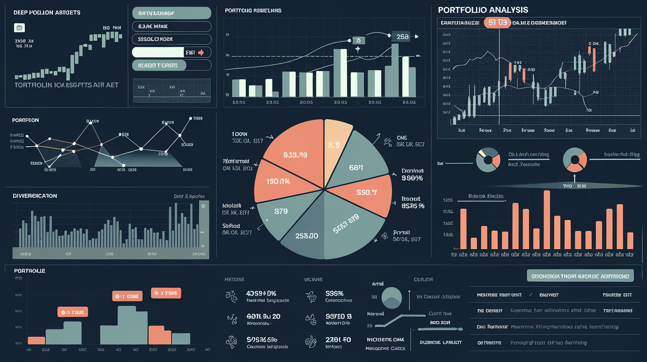
Visualizing your portfolio: Interactive charts for allocation by sector, region, and risk.
Navigating the intricate landscape of personal finance often feels like peering through a kaleidoscope, with countless data points swirling into an indecipherable blur. Traditional investment statements, with their dense tables and static figures, frequently obscure the true composition and underlying risks of a portfolio, leaving even the most diligent investor feeling disconnected from their wealth. This opacity can lead to suboptimal decisions, missed opportunities, and a lingering sense of uncertainty about one's financial trajectory, making it challenging to truly grasp the nuances of one's investment strategy.
However, the advent of artificial intelligence ushers in an era of profound clarity, transforming raw financial data into vibrant, interactive visualizations that illuminate every facet of your portfolio. Imagine moving beyond cumbersome spreadsheets and static reports to a dynamic dashboard where your investments come alive, revealing patterns and connections previously hidden. This intelligent rendering of complex information empowers you to intuitively understand where your capital is allocated, how it's exposed to various market forces, and ultimately, whether it aligns precisely with your long-term objectives and risk tolerance.